COVID-19 Museum Web Traffic Charts
I spoke with journalist Alexander Panetta of CBC News for a story on museums’ use of technology during the pandemic:
Despite this historic opportunity for online learning, with hundreds of millions of people locked out of public spaces, [Spellerberg] says traffic to museum websites plummeted last year.
He began gathering data from 20 museums, mostly American, when the coronavirus struck, and says all but a couple saw their web traffic go down. The average decrease, he says, was 13 per cent.
“The pandemic hits — and you see everybody’s numbers just drop off,” he said.
How can that be? Spellerberg says most people still use museum websites to plan a visit — check opening hours, buy tickets or scan information on exhibits or collections.
Two institutions that were exceptions to his rule happened to be the largest on his list. The Metropolitan Museum in New York and PBS’s interactive museums pages saw web traffic increase.
Here’s the Data
With help from research assistant Grace Poole, I collected Google Analytics Sessions data from cultural institutions. Participants self-selected/opted-in to the project and represent a wide range of institution types and sizes.
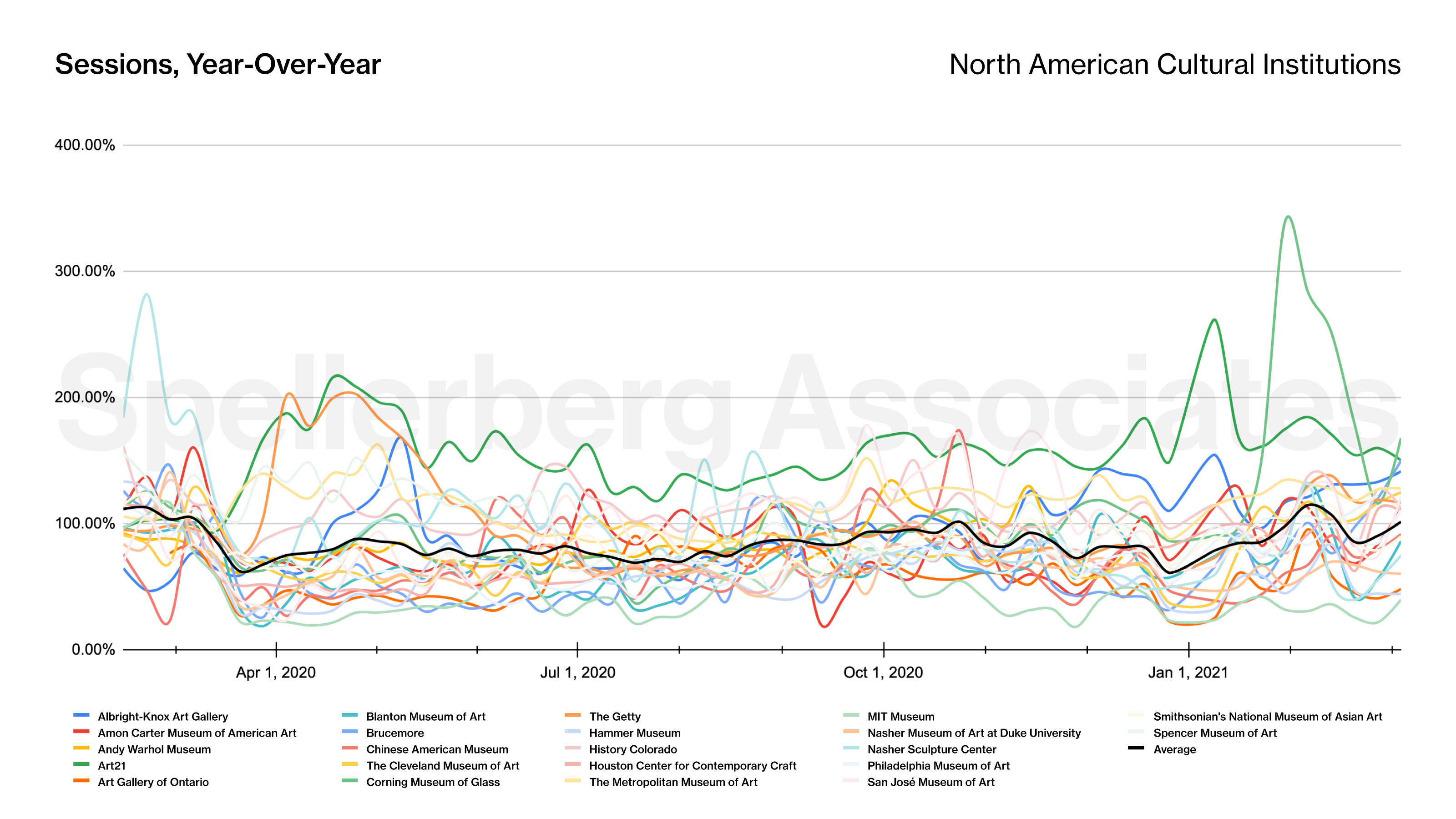
Figure 1 shows 22 institutions in North America, with the average of that set highlighted in black. The lines represent year-over-year percentages. Each institution’s 2020 traffic compared to their 2019 numbers (100% line means parity with pre-pandemic traffic). The average reveals a clear drop corresponding to lockdown, and it stays under 100% for most of the year.
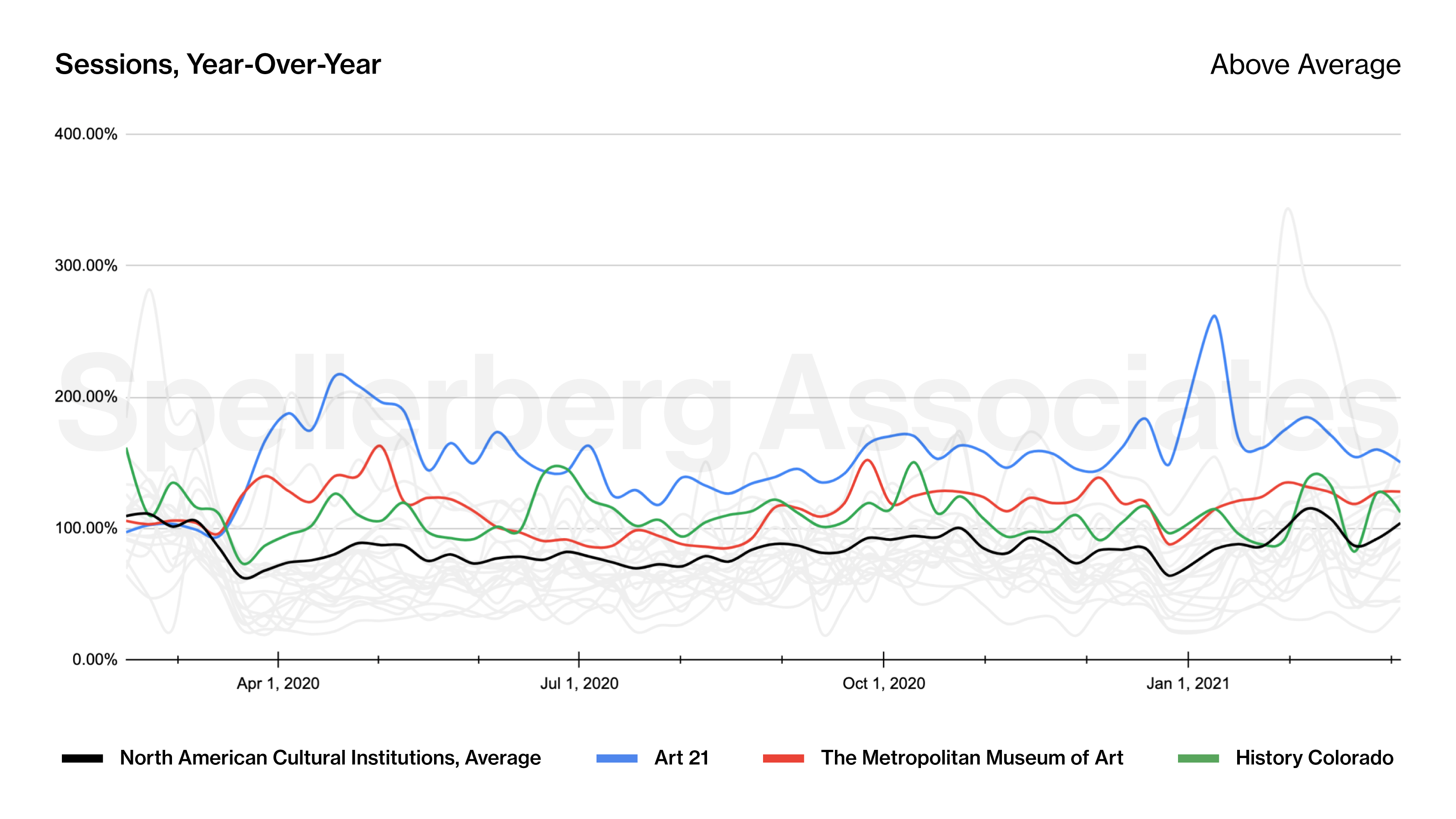
While the average saw a drop of approximately 13% for the year, a few institutions experienced increased traffic. Figure 2 highlights how the websites of Art21, the Metropolitan Museum of New York, and History Colorado experienced web traffic above their pre-pandemic levels throughout the study period. The causes of these increases are likely specific to those institutions’ situations and warrant qualitative examination.
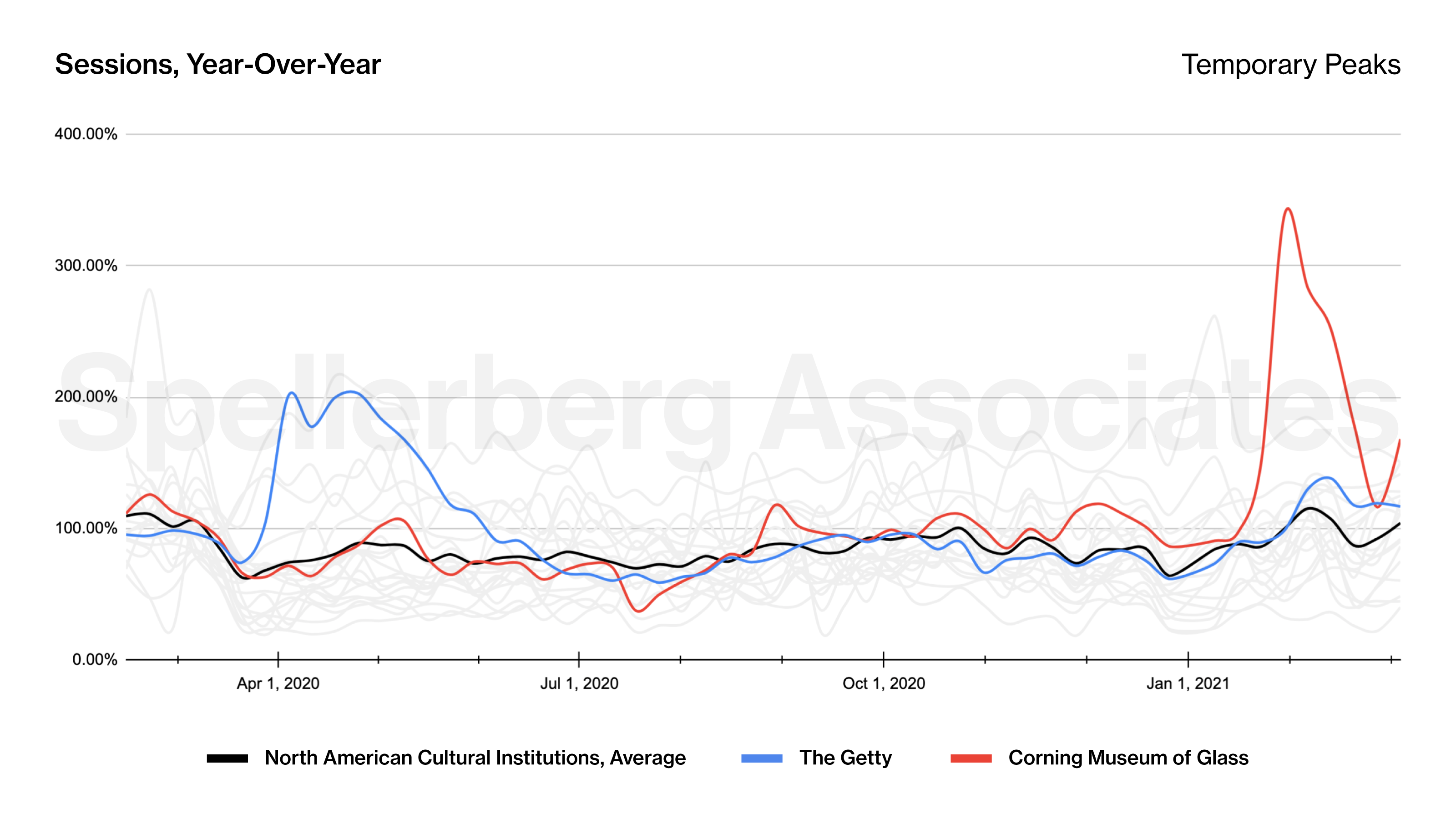
Figure 3 highlights a couple of institutions that experienced dramatic spikes in traffic for limited periods of the year. In both of these cases, we have a pretty good idea of the cause. The increase of traffic to The Getty‘s websites corresponds with the popularity of their “Getty Art Challenge” social media campaign. Tim Hart, Head of Audience Research and Analysis at the Getty, explored these results in a session we presented at the 2020 MCN conference. And the dramatic spike experienced by the Corning Museum of Glass corresponds to their participation in Blown Away, the reality show on Netflix.
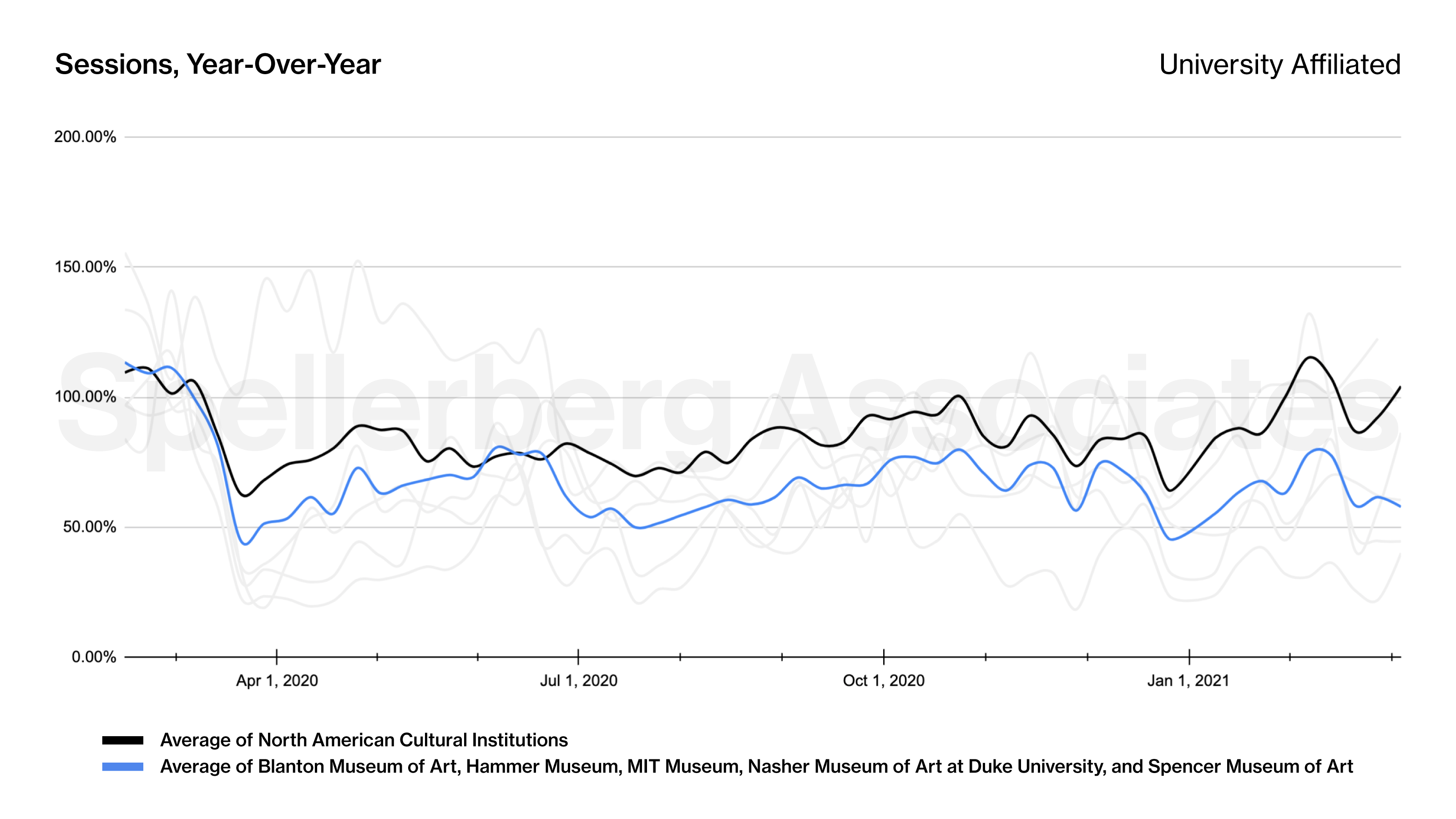
Five of the study participants are university-affiliated museums. Figure 4 highlights that these institutions, on average, saw web traffic that was consistently beneath the benchmark of the study as a whole. Is this indicative of university affiliation, or simply a coincidence? We will require additional data to answer these questions.
I undertook this research, in part, as a way of grappling, on a personal level, with the uncertainty of COVID-19. I hope that this data is helpful to researchers and informative to practitioners. If you are interested in discussing this work and exploring the implications of these findings for your institution’s digital strategy, please reach out via email.
Thank you to the participating institutions: Albright-Knox Art Gallery, Amon Carter Museum of American Art, Andy Warhol Museum, Art21, Art Gallery of Ontario, Blanton Museum of Art, Brucemore, Chinese American Museum, The Cleveland Museum of Art, Clyfford Still Museum*, Contemporary Art Museum St. Louis*, Corning Museum of Glass, The Getty, Hammer Museum, History Colorado, Houston Center for Contemporary Craft, Institute of Contemporary Art Boston*, The Metropolitan Museum of Art, Mingei International Museum*, MIT Museum, Nasher Museum of Art at Duke University, Nasher Sculpture Center, Philadelphia Museum of Art, San José Museum of Art, Santa Cruz Museum of Art & History*, SKMU Sørlandets Kunstmuseum*, Smithsonian’s National Museum of Asian Art, Spencer Museum of Art, Terra Foundation for American Art*, Whitney Museum of American Art*.
* Participated in the project but are not reflected in the charts presented here
Posted May 2021